Jess McMullin completed his B.Sc. in Psychology, University of Alberta.
Connie Varnhagen is an Associate Professor in the Department of Psychology, University of Alberta.
Pheng Heng completed her B.Sc. in Psychology, University of Alberta.
Xornam Apedoe completed her B.Sc. in Honors Psychology, University of
Alberta, and is now a graduate student in the Department of Instructional
Technology, University of Georgia
Correspondence concerning this article should be directed to: Connie K. Varnhagen, Department of Psychology, University of Alberta, Edmonton, Alberta T6G 2E9. Email: varn@ualberta.ca. Phone: (780) 492-0970. Fax: (780)
492-1768.
The World Wide Web (Web) is becoming a popular medium for transmission of information and online learning. We need to understand how people comprehend information from the Web to design Web sites that maximize the acquisition of information. We examined two features of Web page design that are easily modified by developers, namely line length and the amount of surrounding information, or whitespace. Undergraduate university student participants read text and answered comprehension questions on the Web. Comprehension was affected by whitespace; participants had better comprehension for information surrounded by whitespace than for information surrounded by meaningless information. Participants were not affected by line length. These findings demonstrate that reading from the Web is not the same as reading print and have implications for instructional Web design.
Le World Wide Web (ou le Web) est en train de devenir un moyen populaire pour la transmission d’informations et l’apprentissage en ligne. Pour concevoir des sites Web qui maximisent l’acquisition des connaissances, il nous faut bien saisir le processus de compréhension individuel des informations présentées sur le Web. Nous avons examiné deux caractéristiques entrant dans la conception d’une page Web et qui sont faciles à modifier pour les développeurs, à savoir la longueur des lignes et la quantité d’informations ou de blanc environnants. Les étudiants de premier cycle participants ont lu des textes et ont répondu à des questions de compréhension sur le Web. Leur compréhension a été affectée par le blanc ; les participants ont eu une meilleure compréhension des informations entourées par du blanc que des informations entourées par d’autres informations dénuées de sens. Les participants n’ont pas été affectés par la longueur des lignes. Ces résultats démontrent que lire sur le Web est différent de lire sur papier imprimé et ont des conséquences pour la conception de sites Web éducatifs.
The Internet has grown dramatically, particularly as a source for online training and education. Web-based teaching and learning is advocated as a cost-effective supplement or replacement of traditional media. As more post-secondary institutions and corporate training departments adopt an online delivery model, the need to understand the effectiveness of this new medium takes on increasing immediacy. Formal research in optimizing the presentation of online information will allow developers to create online materials that maximize users' comprehension.
The presentation of information provides the foundation for online learning. The physical layout of online content is a key component in the overall presentation. One aspect of layout is the arrangement of text, and given that most current online content is textual, this factor is fundamental in determining the effectiveness of a presentation format. However, the current popular literature offers conflicting advice as to what constitutes optimal text layout.
Lynch and Horton (1999) have argued, "the lines of text on most Web pages are much too long for easy reading" (p.85). Lynch and Horton therefore advise Web designers to constrain the width of text passages in order to make it easier for users to read. Reducing line length results in non-text blank space, or whitespace, surrounding the text as interpreted by most browsers. Bernard, Chaparro, and Thomasson (2000) examined users' search times and preferences for Web sites differing in amount of whitespace. They found no difference in search time as a function of amount of whitespace but users preferred enough whitespace to separate different units of information. Spool, Scanlon, Schroeder, Snyder, and DeAngelo (1998) completed a usability study of major commercial Web sites, and found that an increase in whitespace corresponded to a decrease in performance on a search task. Thus, the findings of Bernard et al. and Spool et al. indicate that more text on the screen might be more appealing and easier to read than less text surrounded by more whitespace.
Authors of print design texts (e.g., Wilson, 1974) have advised that text presented in a print format be displayed in narrow columns. Print research supports this assertion by indicating that narrow columns of text are read faster and are comprehended better (Tinker, 1963). Early research on reading from computer monitors also supports the notion that short line lengths and increased whitespace aids reading speed and comprehension (van Nes, 1986; de Bruijn, de Mul, & van Oostendorp, 1992). Manipulations of text layout to optimize reading speed from computer monitors focused originally on whitespace variables like spacing and indenting (Muter & Maurutto, 1991).
Updated research is needed on reading from computer monitors. Advances in technology have significantly increased the quality of monitor displays and may have changed the effects of line length on reading and comprehension. As well, people are beginning to use the Web more and more and experience in reading from computer monitors while browsing or learning from the Web might make a difference in the effect of line length on reading and comprehension. Dyson and Kipping (1998) found that, although participants preferred shorter line lengths for reading from the Web, their reading comprehension was not affected by narrow versus wide text layout.
Given the inconsistencies in the research and in the design literature, we performed our own study of text layout in order to increase understanding of the optimal text presentation format. There are many components of text layout, including line length, whitespace surrounding the text, spacing between lines, size and shape of characters (font size and type), spacing between characters (kearning), and alignment of text (justification) (Gould, Alfaro, Barnes, Finn, Grischkowsky, & Minuto, 1987). We chose to focus solely on line length and whitespace. Web developers can more easily control these two factors than other factors, such as font size and type, which are affected by system controls.
Although our primary concern was disentangling the line length issue, we included an examination of total whitespace as a function of "text density" because, as line length varies, so does the amount of surrounding empty space. Some Web pages are sparse _ others are packed with text and graphics. Thus, we varied whitespace by changing the amount of text displayed in order to examine the effects of this potential confound to the manipulation of line length.
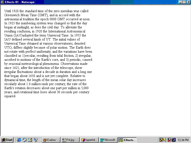
Participants read short prose passages in wide or narrow formats and with the surrounding whitespace filled or not filled with additional, unimportant information. We defined line length as the number of characters, including spaces, which are displayed as one line in the application window. We defined whitespace as the amount of information presented; in the one-column/paragraph condition, only the to-be-read text was presented and in the two-column/paragraph condition, additional, meaningless text was presented next to or below the to-be-comprehended text. Combining these line length and whitespace factors, we created four conditions: Narrow passages, with approximately 55 characters per line, were either presented alone, in a single column of text with white space to the right of the text, or in a two-column format, with uninformative text presented in a second column to the right of the text. Wide passages, with 115 characters per line, were either presented alone with white space below the text or in a two-paragraph format, with uninformative text presented in a paragraph below the to-be-read text.
We assessed the effects of line length and whitespace on comprehension by having participants read the texts and answer multiple choice questions about each text. To determine whether experience with reading off a computer screen might affect the results, participants also completed a computer experience questionnaire.
Sixty-seven undergraduate students enrolled in introductory psychology classes at the University of Alberta participated in this experiment as partial fulfillment of course requirements for research participation. Nine participants did not complete the procedure and their data were not included in the analyses. Based on the responses to a computer questionnaire administered at the end of the procedure, the participants were 15 males, and 42 females (with one no response). The majority (N = 32) of the participants were first year students.
The text used for this experiment consisted of eight passages, each approximately 200 words in length. We selected relatively dense, factual passages from an encyclopedia and from a book on constellations. We edited the passages to contain enough information to create five multiple choice comprehension questions for each passage but still be able to be read at least once in two minutes. All the passages and comprehension questions were piloted to ensure the texts and questions were of equal difficulty.
Wide (115 characters per line) and narrow (55 characters per line) versions of the text were created and accompanying paragraphs written in pseudo Latin, were adapted from an example found on the Web at http://www.uni-mb.si/local/fontfaq/cf_36.htm . Figure 1 shows the four conditions of line length crossed with whitespace.

Figure 1a. Sample text: Narrow, one-column version.
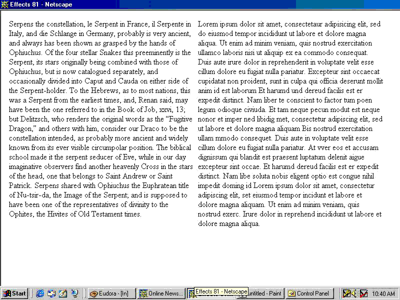
Figure 1b. Sample text: narrow, two-column version.
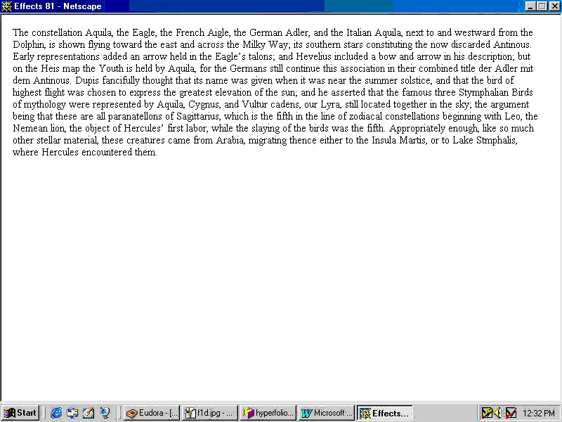
Figure 1c. Sample text: wide, one paragraph version.
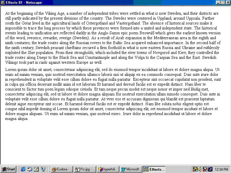
Figure 1d. Sample text: wide, two-paragraph version.
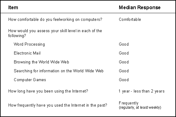
We also created a questionnaire to collect demographic and computer use information (see Table 1).
Web pages were created and a database was used to format the texts in narrow and wide versions as well as formatting the pseudo Latin text. Links were created to allow participants to begin the experiment, continue to the next passage after completion of the questions, continue to the questionnaire after the last set of questions and, finally, signal the end of the experiment.
Participants were tested in groups of 12 to 15 students working at individual workstations in a 30 min session. They were given instructions as a group.
Participants read eight short passages on the Web, two short passages in each condition. Passages were counterbalanced across conditions and participants. Participants were told that some of the text were accompanied by a text written in another language and were instructed to read the English part only. Participants were given two minutes to read a passage and then answered five comprehension questions for the passage. After answering the questions, participants clicked on a link to progress to the next passage. Upon completion of the last set of questions, participants completed a brief questionnaire about their computer experience, were debriefed, and were given their participation credit.
Table 1 summarizes the participants' computer use skills. Although there was a range of abilities, the participants generally had been exposed to computers and had used the Web. Thus, these data are not based on totally naive computer and Web users.
Table 1. Summary of participant computer skills
Percent correct answers to the comprehension questions were analyzed in a 2-way repeated measures analysis of variance, with line length (narrow versus wide line length) and whitespace (one versus two column presentation) as factors. There only effect was a main effect of whitespace, F (1, 57) = 4.90, p < .05. In the one-column presentation condition, participants correctly answered an average of 63% of the questions ( SE = 1.9%) compared with correctly answering 58% of the questions ( SE = 1.9%) in the two-column presentation. There was no difference in percent correct as a function of line length. Averaged across the whitespace factor, participants correctly answered an average of 61% of the questions (SE = 1.8%) in the narrow line length condition compared with correctly answering 60% of the questions (SE = 1.9%) in the wide line length condition.
We created a composite computer experience grouping variable based on the participant's responses to four items on the computer skills questionnaire (see Table 1). First, we collapsed the items dealing with comfort working on computers, skill at browsing the Web, skill at searching the Web, and frequency of Web use into dichotomous variables. The comfort item was collapsed into "very comfortable" and "comfortable" versus "somewhat comfortable," "slightly comfortable," and "not at all comfortable." The browsing and searching the Web items were collapsed into "excellent" and "good" versus "fair," "poor," and "none." The frequency item was collapsed into "very frequently" and "frequently" versus "sometimes," "seldom," and "never." Participants whose ratings fell into the more experienced categories on all four items were classified as experienced Web users (N = 21) and the remaining participants (N = 37) were classified as being less experienced Web users.
We included this grouping variable in a one between subjects (experience) by two within subject (line length and whitespace) repeated measures analysis of variance of proportion comprehension questions answered correctly. As with the original analysis, the only significant effect was a main effect of whitespace, F(1, 56) = 6.34, p < .05. There were no other main effects or interactions with computer experience.
We also repeated this analysis with the four individual items and with gender as separate grouping variables. The main effect of whitespace remained in each of these analyses, and we obtained no other main effects or interactions.
Whitespace affected comprehension as measured by comprehension questions; participants appeared to be distracted by the additional column/paragraph of information and performed slightly less well on the comprehension questions than when the information was surrounded by white space. This is a robust effect that was not mediated by various types of Web experience or gender.
While a 5% difference in performance as a function of whitespace may not be very large, it could be the difference between passing and failing a course. As with the Dyson and Kipping (1998) study, line length did not significantly affect comprehension; participants answered as many questions correctly when they read the text in wide and narrow line length formats.
It appears that whitespace was not the confounding but the defining variable in optimizing reader comprehension. This is in agreement with the Lynch and Horton (1999) suggestion that whitespace may help decrease the need to scan across the entire monitor. This would be important because online training and education tasks may require many hours in front of a computer screen, which could be tiring for the viewer's eye span. Also, whitespace appears to help by preventing the influence of distracting, unimportant information. Whitespace can play an important role in spatially organizing associated information. By just having whitespace, instead of irrelevant text, participants were better able to concentrate on the important information and no extra effort was required to ignore uninformative information.
The results from this study contrast with the Spool et al (1998) findings that less whitespace and more text increased user performance. But, Spool et al studied participants' performance on a search task, whereas this study focused on reading comprehension. Search tasks require scanning through many lines of text in order to find a specific item, requiring more motor movements, but reading for comprehension requires more cognitive thought processes and thus we expect differing results from the two tasks. As well, searching performance may increase with more information on the screen concurrently. Rather than having the cognitive load and spatial dislocation of scrolling or jumping to a new hypertext document, users are able to search for information on one screen. It may be that denser text correlates to better search performance, but poorer comprehension.
While the general principle that an increase in whitespace will result in better user comprehension is supported by our results, the assertion that line length should be restricted is not. Indeed, our research supports recent research by Dyson and Haselgrove (2001), who showed that very small line lengths (25 characters per line) slowed reading and led to less comprehension than relatively longer line lengths (55 and 100 characters per line). These convergent findings contradict the print literature and the advice offered by Lynch and Horton (1999). One reason that longer line length on a computer monitor may not show an effect is simple geometry: the length subtended by the angle of vision increases with distance from the viewer's eyes to the reading material. Since computer monitors are viewed at greater distances than most print material, the eyes can transverse greater line lengths with motions that are equivalent to the recommended line lengths in print. The computer monitor resolution used in this study's experimental condition may not allow great enough line lengths to indicate an effect equivalent to long line lengths in print.
As well, print findings may not generalize well because computer monitors are a different medium, with different variables that may affect comprehension. The results of print research do not address the questions of monitor refresh rate, screen resolution, gamma, and reflected vs. emitted light. Print results should not be applied to Web sites or other computer-based platforms without consideration for the unique aspects of computer monitors. In the literature, there appears to be a significant period of time where little research was done on reading from computers. With the rapid pace of changing display technology, results that are only a few years old may not apply well to current systems. This trend will become even more significant as new display types supplant computer monitors. Research in this area needs to be ongoing in order to provide a contemporary understanding of human learning using digital media.
In the context of previous literature, the central implication of our results is that the goals of the Web site need to be understood. Web sites may contain pages that are primarily directive _ they direct users to other information, acting as navigation. Sites may also contain pages that are informative _ they present content intended for online reading, such as articles. These types of pages address different user needs and involve different tasks: searching, and comprehension. The optimal layout for one kind of page is not appropriate for the other.
These results are for a specific design context. Our sample texts were displayed completely in one screen. This negated the confounding effects that scrolling or multiple pages would introduce. However, the results may not generalize completely in situations where the content is presented in either a series of distinct documents, or as one long scrolling page. Since many Web sites present informative pages in one of these two ways, further research is required to examine the interaction of the mode of presentation with the other layout factors already investigated. Chunking research indicates that information should be presented in discrete, associated segments (Miller, 1956). This segmentation needs to be considered when presenting content. However, there is still no conclusive research as to what is better: using whitespace and other cues to segment one long page, or breaking the chunks into separate documents. Two leading designers have differing views (Nielsen, 1996; Tognazzini, 1999). Empirical studies that encompass past literature in chunking, presentation mode (scrolling vs. separate pages), and layout considerations using current display technology need to be pursued. This new research will provide insight that generalizes better to the current state of online information.
This research was supported by a Learning Enhancement Envelope grant from Alberta Advanced Education and Career Development awarded to the second author.
Bernard, M., Chaparro, B, & Thomasson, R. (2001). Finding information on the Web: Does amount of whitespace really matter? Usability News, 2. Retrieved January 7, 2002, from http://wsupsy.psy.twsu.edu/surl/usabilitynews/2W/whitespace.htm
de Bruijn, D., de Mul, S., & van Oostendorp, H. (1992). The influence of screen size and text layout on the study of text. Behaviour and Information Technology, 11, 71-78.
Dyson, M.C., & Haselgrove, M. (2000). The influence of reading speed and line length on the effectiveness of reading from screen. International Journal of Human-Computer Studies, 54, 585-612.
Dyson, M.C., & Kipping, G. (1998). The effects of line length and method of movement on patterns of reading from the screen. Visible Language, 32, 150-181.
Gould, J. D., Alfaro, L., Barnes, V., Finn, R., Grischkowsky, N., & Minuto, A. (1987). Reading is slower from CRT displays than from paper: attempts to isolate a single-variable explanation. Human Factors, 29 , 269-299.
Lynch, P. & Horton, S. (1999). Web style guide: Basic design principles for creating web sites. New Haven, CN: Yale University Press.
Miller, G. (1956). The magical number seven plus or minus two: Some limits on our capacity for processing information. Psychological Review, 63 , 81-97.
Muter, P. & Maurutto, P. (1991). Reading and skimming from computer screens and books: The paperless office revisited? Behaviour and Information Technology, 10, 257-266.
Nielsen, J. (1996). Top ten mistakes of web design. Retrieved January 7, 2002, from http://www.useit.com/alertbox/9605.html
Spool, J., Scanlon, T., Schroeder, W., Snyder, C., & DeAngelo, T. (1998). Web site usability: A designer's guide. San Francisco, CA: Morgan Kaufmann.
Tinker, M. (1963). Legibility of print. Ames, IA: Iowa State University Press.
Tognazzini, B. (1999, May). Text: the long and short of it. Retrieved January 7, 2002, from http://www.asktog.com/readerMail/1999-05ReaderMail.html#Anchor-Text-44867
van Nes, F.L. (1986). Space, colour and typography on visual display terminals. Behaviour and Information Technology, 5, 99-118.
Wilson, A. (1974). The design of books. Salt Lake City UT: Peregrine Smith, Inc.
© Canadian Journal of Learning and Technology